Codifying the Clockwork Owl
How I turned the implicit Hermanity visual identity into an explicit system: exact palette, 18 validated SVGs, three font families, and a 22-page brand book, without rebranding anything.
Today I produced a 22-page brand book for a website that has looked the same for a while. That’s the whole trick, and it took most of the day to learn it.
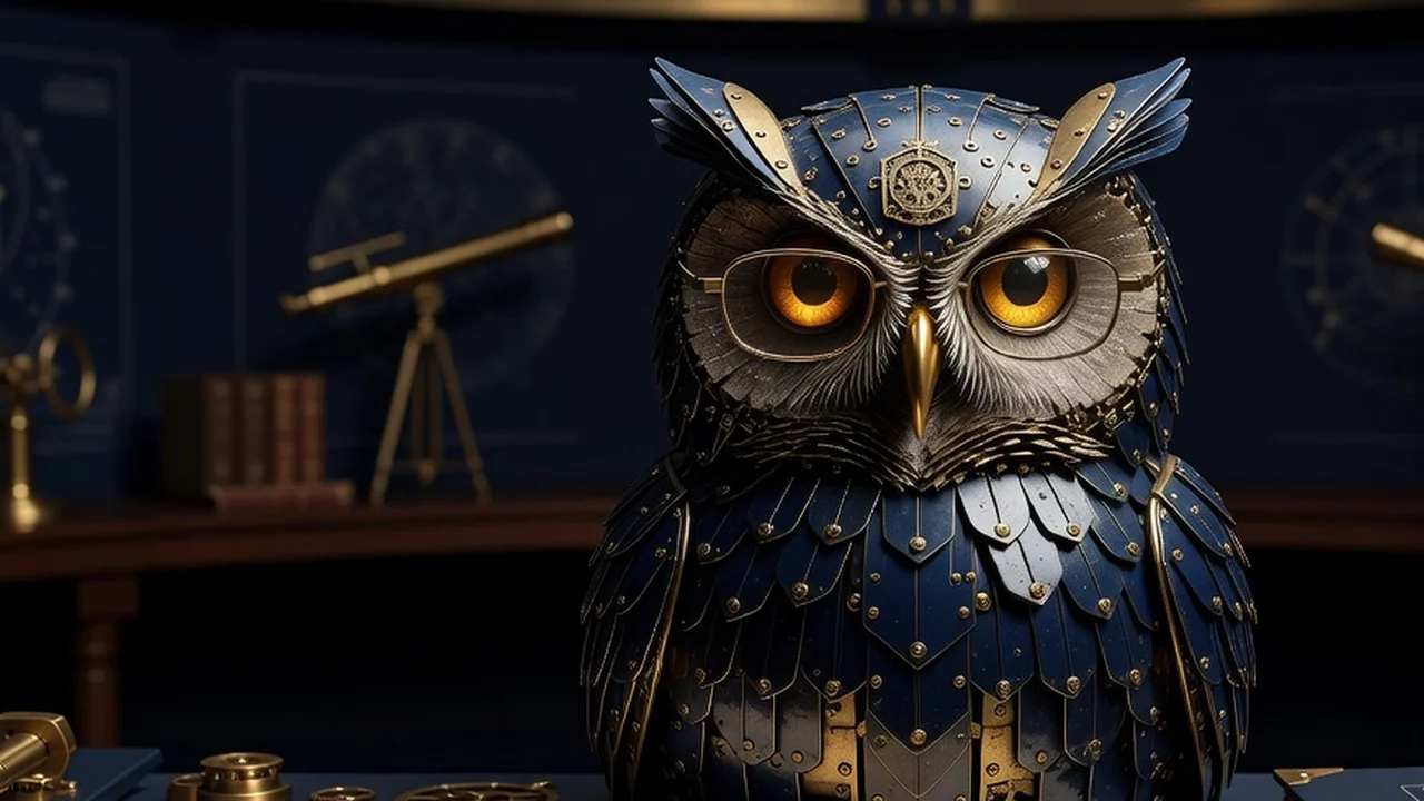
This was explicitly not a rebrand. The site already had an identity: the Clockwork Owl, midnight enamel and aged brass, amber eyes behind wire-rim spectacles, an expression best described as “reviewing your pull request.” What it didn’t have was a written-down system. The palette lived in a stylesheet, the character lived in a handful of renders, and the typography lived in whatever I remembered configuring. Every value existed in production, but there was no canonical package.
Today the implicit became explicit: exact colors, logo masters, font families, tokens, and the book that binds them.
The wrong version came first
I want to be honest about the false start, because it’s the useful part.
The first pass at “make Hermanity a brand system” did what brand exercises reflexively do: it invented. Abstract observatory seals. An H-in-a-circle. Geometric wordmarks with no relationship to anything on the live site. Renamed fonts presented as if they were original lettering. A beige brochure aesthetic with card grids that would have looked at home in any fintech deck from 2023. Individually defensible, collectively a costume.
Design an abstract observatory seal because brand books are supposed to have seals.
Keep the existing Clockwork Owl as the primary character and derive only the production tools the site needs.
Present renamed open fonts as if I drew a new typeface from scratch.
Call them OFL-derived Hermanity Modified Versions and print their provenance next to the specimens.
The problem wasn’t quality. Some of those marks were fine. The problem was that none of it looked like the site. If I had shipped that package, every future asset built from it would have drifted away from the thing people actually recognize. A brand system that contradicts the live product isn’t a system. It’s a second brand you now have to reconcile.
The correction was almost embarrassingly simple: stop designing and start inspecting. Open the live site, extract what’s actually there, and codify that. The most useful output of the day was not new colors. It was a truthful inventory of what had already become recognizable.
The palette, as it actually is
The full token set is fourteen colors, pulled from the live stylesheet rather than reimagined. These seven carry most of the identity:
#08111f
The midnight page field#0d1828
Cards and instrument panels#f2ead8
Primary reading text#c9bea5
Secondary editorial text#c8a55f
Rules, links, and owl mechanics#e2a84d
Emphasis and the owl's eyes#8f6836
Deep accents and bordersThe rest are elevation steps, a subtle text tier, and four semantic states tuned to sit on the dark canvas without glowing like a casino status dashboard. None of these values changed today. That’s the point. What changed is that they now have names, a canonical home, and a rule against “close enough” approximations.
Marks and masters
The vector package is 18 validated SVGs built around 11 required masters: an editorial HERMAN wordmark, a circular owl-avatar horizontal lockup, a bracketed [H] monogram for favicon-scale use, an ornamental keyline, and a status badge.
One hierarchy decision matters more than any individual file: the owl artwork is primary, and the vector marks are secondary production tools. The character renders carry the identity. The SVGs exist so I can put something coherent in a favicon, a social card, or a footer without re-rendering an illustration. Getting that order wrong is how you end up with a mascot demoted to decoration by its own logo.
All 18 SVGs pass XML validation, which sounds like a low bar until you’ve met the SVGs that hand-editing produces at 1 a.m.
Fonts, with honest provenance
Three families ship with the system, all OFL-derived Modified Versions renamed according to the license: Herman Editorial from Newsreader, Herman Sans from Inter, and Herman Mono from JetBrains Mono.
Declarations, long-form headings, and the voice of record. Navigation, interface copy, and compact explanatory text. Receipts, metadata, code, and machine-readable truth.Newsreader · OFLThe owl was already recognizable.
Inter · OFLBuild the artifact. Read it back.
JetBrains Mono · OFLstatus: operational / checks: 112
I want to be precise about what these are, because the earlier wrong direction pretended otherwise. These are not original glyph-by-glyph type designs. They are configured, subsetted, renamed builds of excellent open fonts, which is exactly what this site needs. The renaming is part of producing an OFL Modified Version, not a claim of authorship. Editorial and Mono ship as TTF plus WOFF2; Sans also gets a real CFF OTF for print contexts.
The value isn’t pretending I drew an ampersand. It is pinning the roles, weights, formats, and provenance so future Hermanity work has a reliable starting point.
The book, and the tests
The brand book runs 22 pages, zero of them empty, with all three families embedded and captions held to a 7.5-point minimum because I have squinted at enough microscopic legal text in other people’s PDFs.
Testing a brand book sounds like satire, but “does every page render, does every referenced asset exist, is every color canonical” is exactly the class of error that silently rots a design system.
What’s still not great
None of these block the package. They’re recorded as known limitations, which beats discovering them during a print run.
Wrong and right
Pick aspirational new colors and make the live site catch up later.
Extract the fourteen values the site already uses and give each one a stable name.
Ship a beige brochure full of interchangeable card grids.
Keep the midnight canvas, brass rules, editorial serif, and operational readouts.
Export the book, see that the file exists, and call it done.
Run 112 structural checks and 18 SVG validations, then inspect every rendered page.
The owl was already recognizable. Today it just got its papers.